Website Redesign Concept for TheSims3.com
Web Redesign
UI/UX Design
Creative Direction
Art Direction
Brand Refinement / Implementation
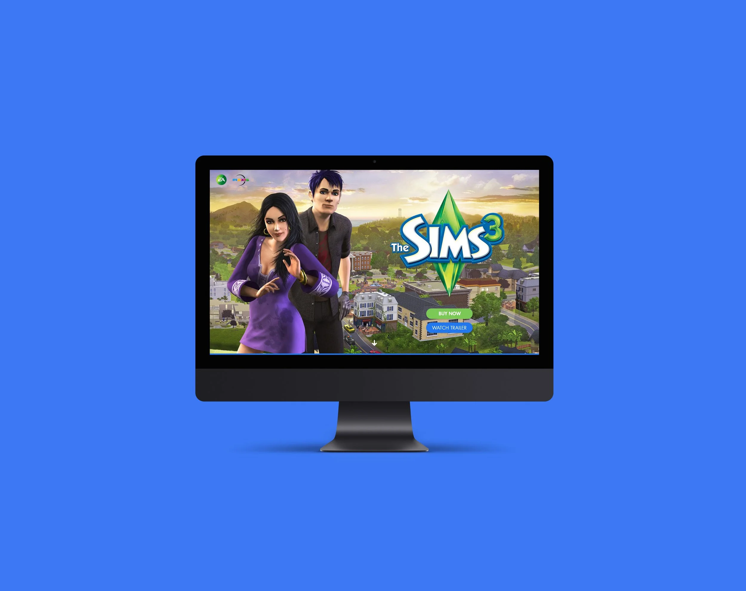
The Sims 3 official website, compared to other websites, is really outdated, it never left the 2000s. So, I re-imagined the website to how it would look like updated to the present.
In addition to the site looking outdated, as an end user and gamer myself, I found some problems while using the platform, mostly with navigation, systems, readability and presentation. To address these, I redesigned the whole look of the website based on its existing brand identity and visual direction, refined the branding implementation to the site, experimented with different layouts and systems for presentation, organized the content, created some new systems and layouts, refined the existing elements and systems, and other necessary adjustments to improve the look and usability, and fit modern gaming website trends and standards.
I was inspired by the different gaming websites and the current The Sims website while doing this exercise. The Sims 3 site is one of the sites I often visit, and I really love for it to look updated, so I made this a personal project of mine to practice graphic and web design.
All the photos and text used are from EA and The Sims 3.
I want to thank the following Simmers for letting me borrow their photos and usernames for the redesigned Exchange page mock-up: @faeriefrolic, @shuckleberrysims, @miss-may-i, @ticklemerainbows, and @simsreaper :)

TheSims3.com landing page


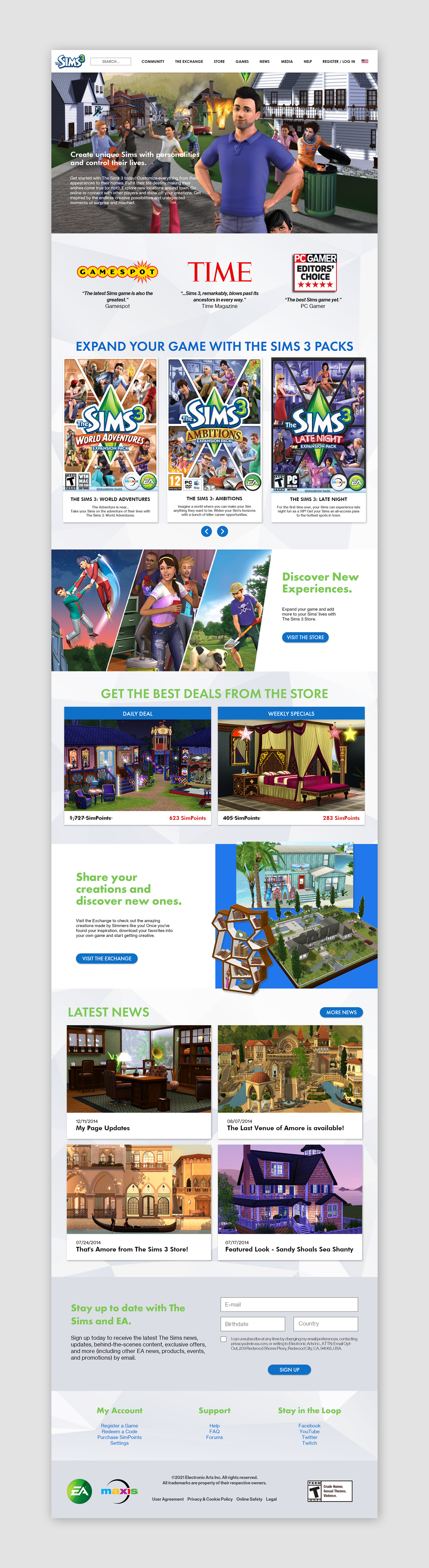
TheSims3.com home page
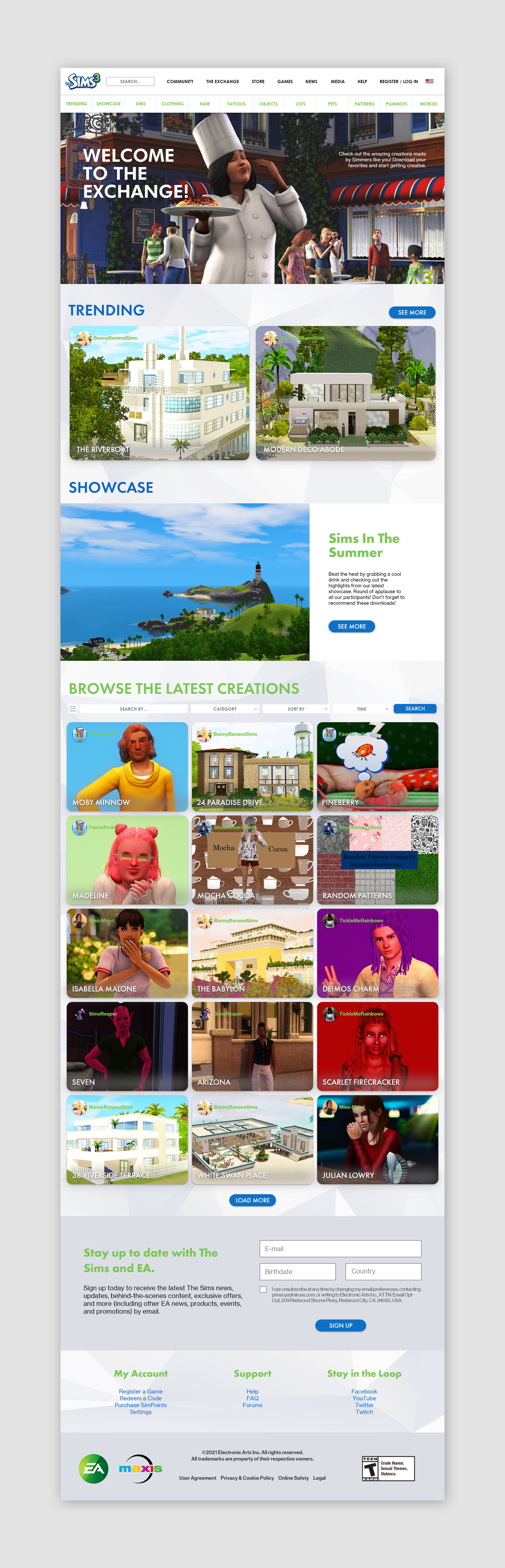
The Sims 3 Exchange site
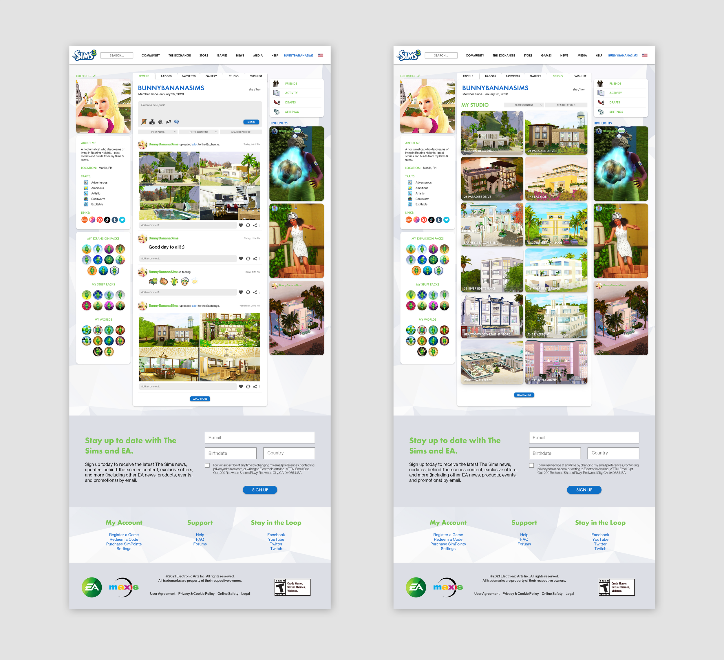
The Sims 3 account page
Website Redesign Concept for The Sims 3 Store
Web Redesign
UI/UX Design
Creative Direction
Art Direction
Brand Refinement / Implementation
The Sims 3 Store, which is part of the official The Sims 3 website, is also outdated, and I re-imagined the website to how it would look like updated to the present, while still retaining the original branding and aesthetics.
The goals for this exercise are to update the online store to modern trends and aesthetics, improve readability, navigation and presentation of the digital products of the game, which were all addressed in the final output. As the end user myself, I considered how players like me navigate and use the platform and how it could be better. I studied the visual direction and brand identity of the game, refined its implementation to the site, experimented with layouts, systems and colors to improve the presentation and make it neat, organized, intuitive, colorful and visually appealing to modern gamers and audiences.
I was inspired by the different gaming websites, the current The Sims website, and contemporary online stores we have today. The Sims 3 Store site is one of the sites I often visit, and I really love for it to look updated, so I made this a personal project of mine to practice graphic and web design.
All the photos and text used are from EA and The Sims 3.

The Sims 3 store home page


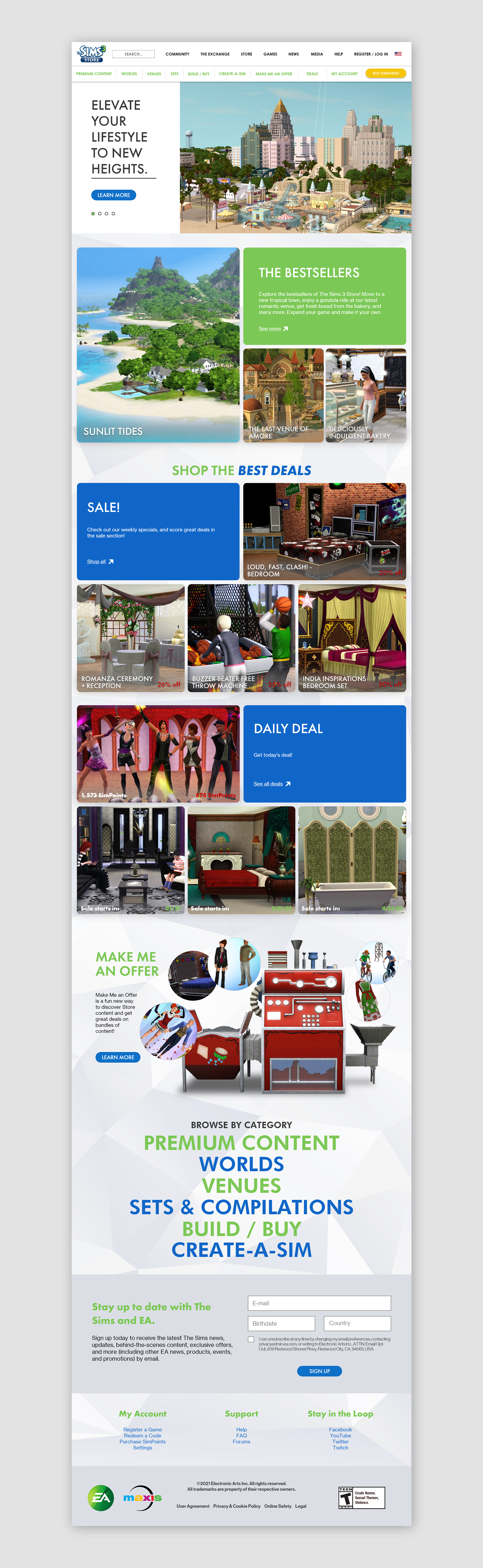
The Sims 3 store home page

The Sims 3 Store - Worlds page

The Sims 3: Roaring Heights page
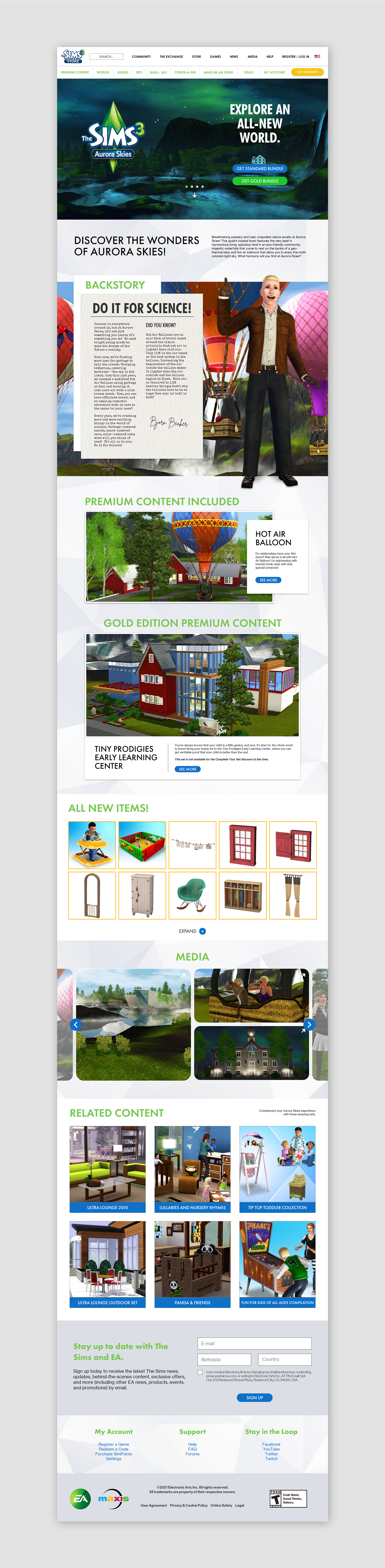
The Sims 3: Aurora Skies page